
Draper Dukes Development
Draper Dukes Development was formed from a strategic partnership between two established businesses: Tetris Group, a construction company, and Dukes Estate Agents.
Together, they created a new development company that fused their combined expertise to offer something bigger — a full-circle, experience-led approach to property development.
As a junior designer in my first studio role, this was one of my earliest pitch opportunities — and a chance to demonstrate my ability to think conceptually. I approached the project not just as a logo exercise, but as a brand story waiting to be told — one that could connect with people on a lifestyle level and translate across every customer touchpoint.
More Than a Mark
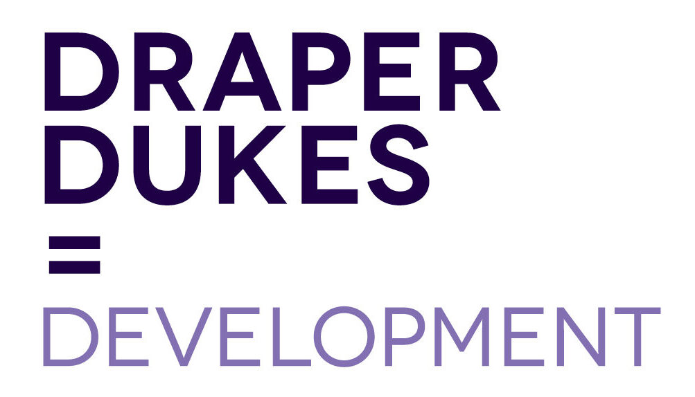
The final identity is a clean, professional logotype in two shades of purple — symbolising unity and quality. The standout detail is the equals sign preceding the word “Development”: a simple yet powerful visual cue that reads as Draper + Dukes = Development. This instantly communicates the brand’s core story — that combining the strengths of two successful companies creates something greater.
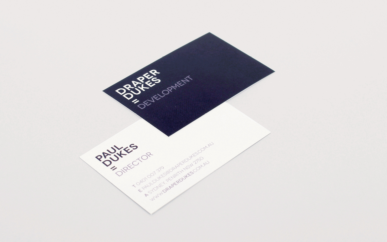
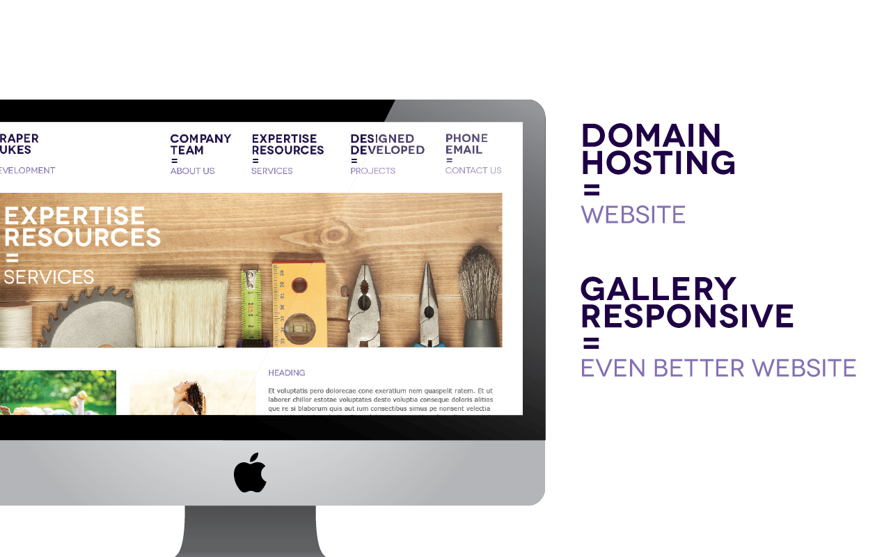
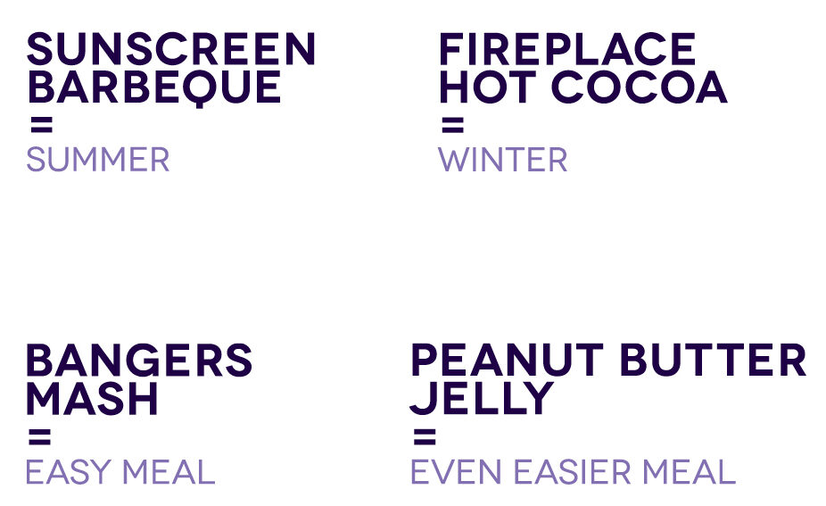
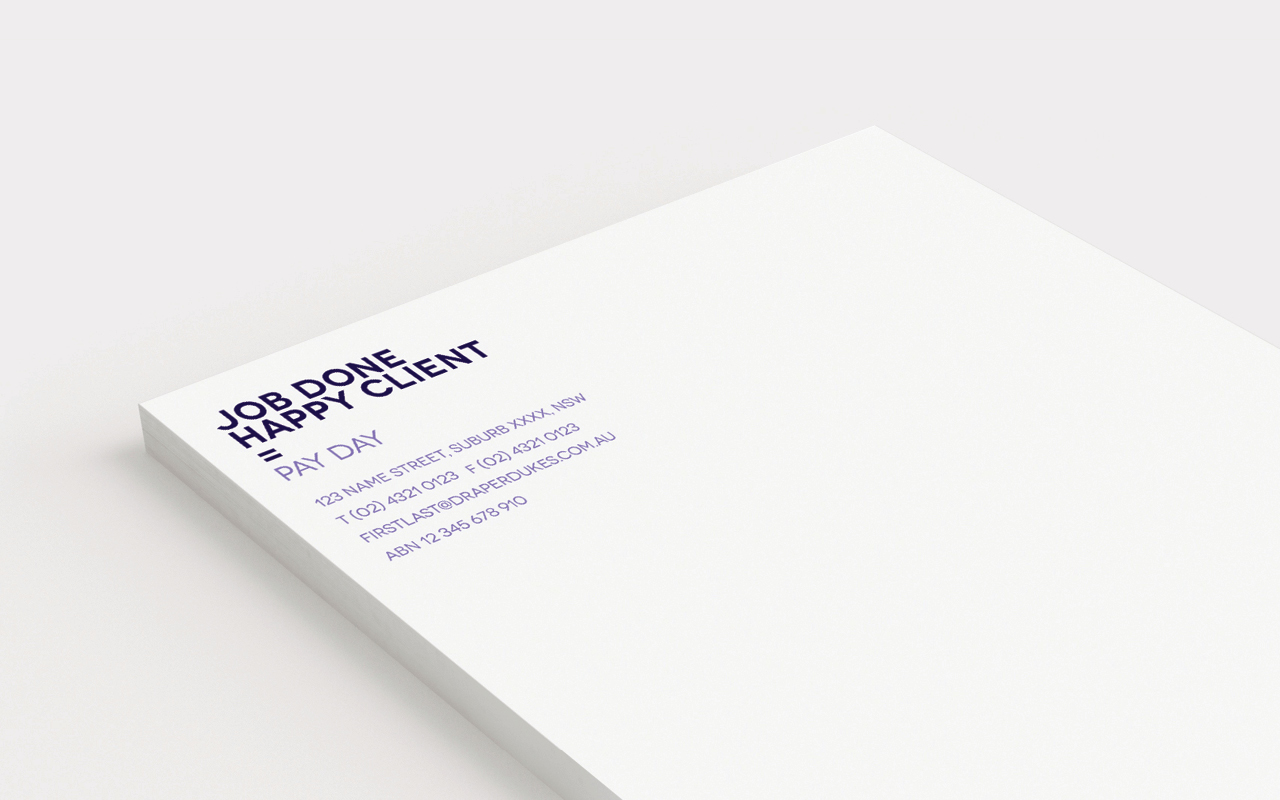
This concept of combination as transformation became the foundation for a flexible, expressive brand system. Messaging could shift depending on context, with creative pairings like Sunscreen + BBQ = Summer, Fireplace + Hot Cocoa = Winter, or Pencils + Ideas = Endless Possibilities. From mugs and business cards to job invoices and marketing collateral, the equals sign format provided an instantly recognisable, endlessly adaptable storytelling device.